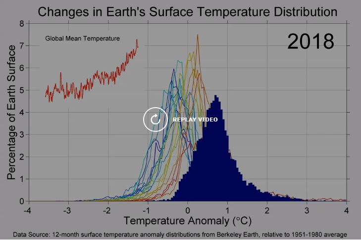
 This animation shows the evolving distribution of 12-month average temperature anomalies across the surface the Earth from 1850 to present. Anomalies are measured with respect to 1951 to 1980 averages. The red vertical line shows the global mean, and matches the red trace in the upper-left corner. The data is from Berkeley Earth and the animation was prepared with Matlab. Source.
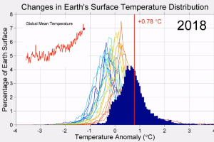